Wholly Balls
Protein bites with personality
Wholly Balls needed a complete rebrand and packaging system that could make a small protein bites company feel more memorable, expressive, and shelf-ready. The direction balances bold snack energy with an outdoorsy, better-for-you attitude: punchy type, bright flavor color, organic pattern, and a name that should feel impossible to ignore.
01
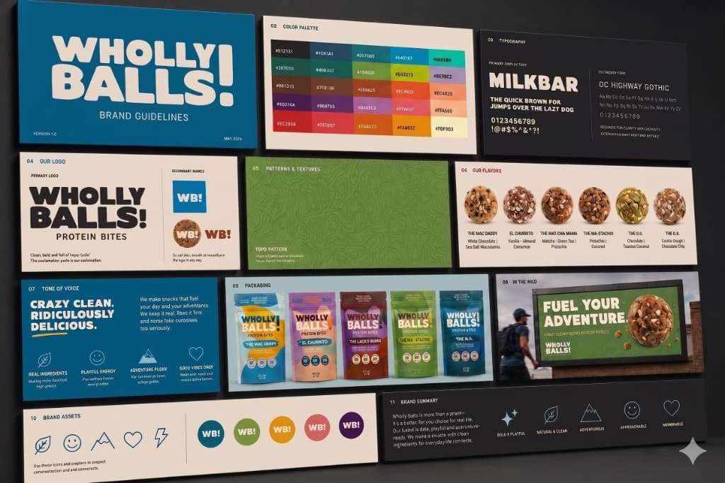
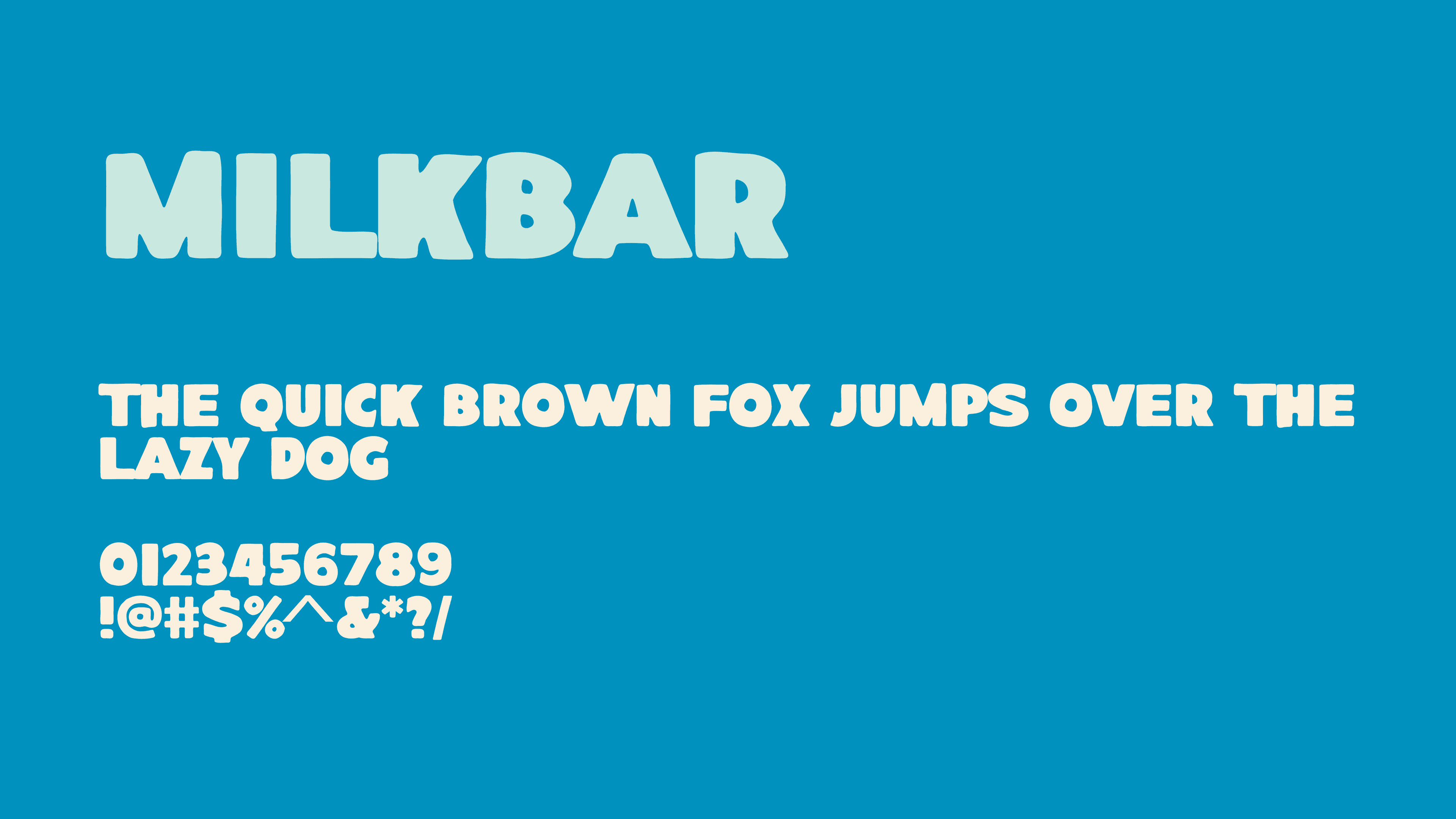
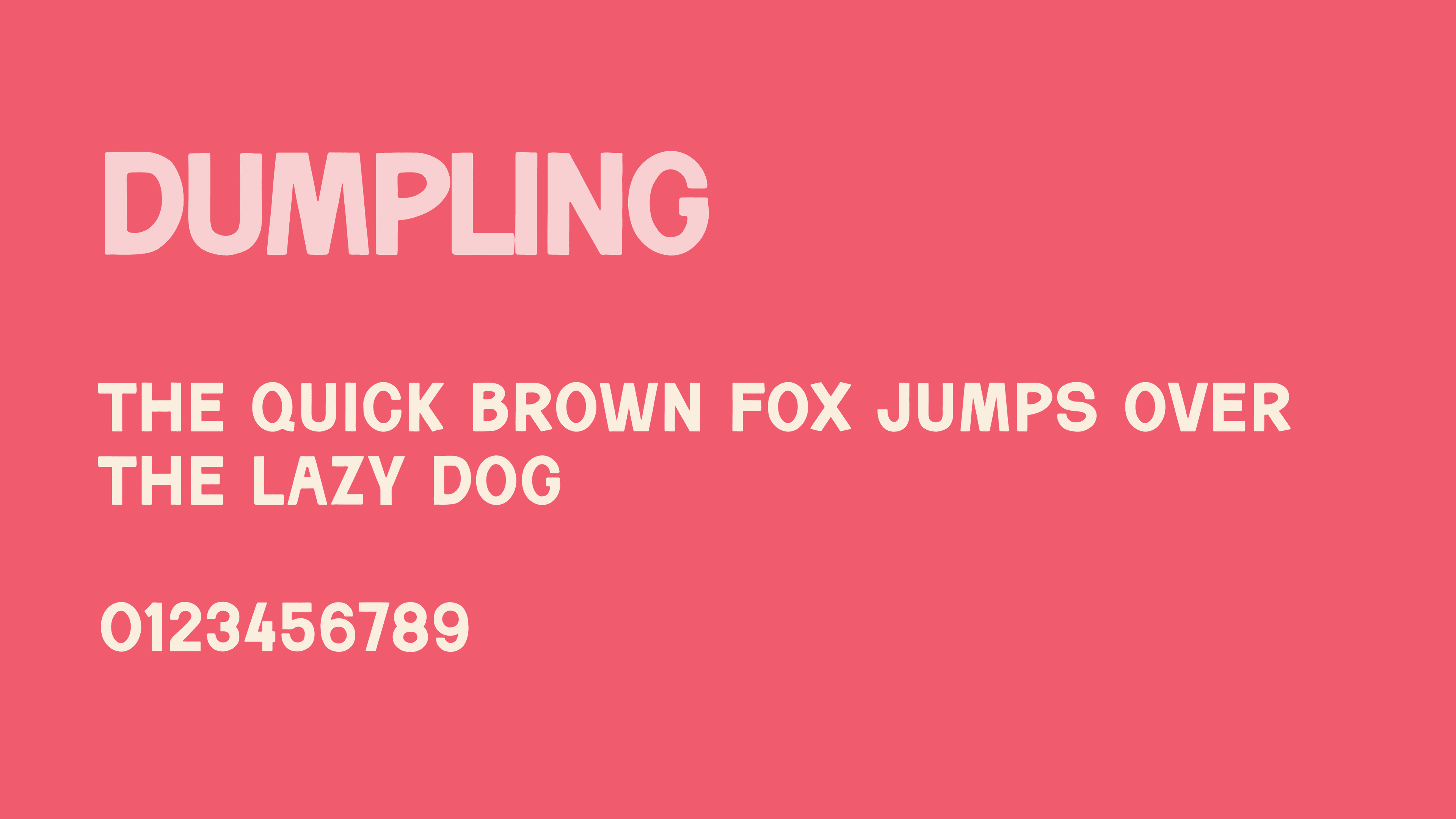
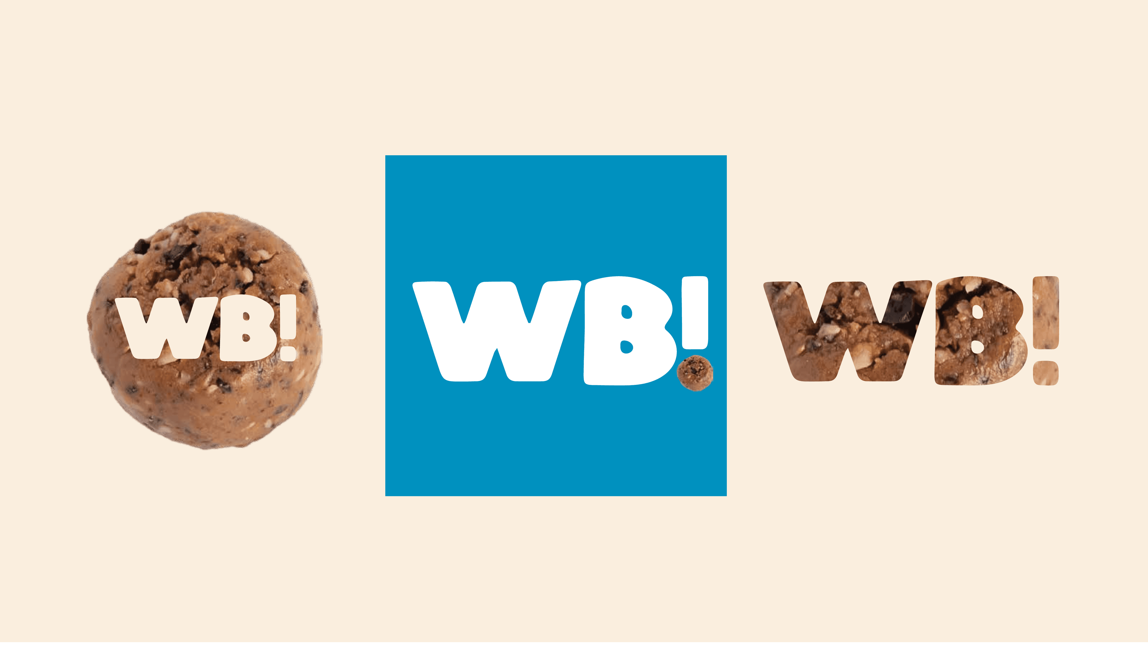
Turning a funny name into a real brand
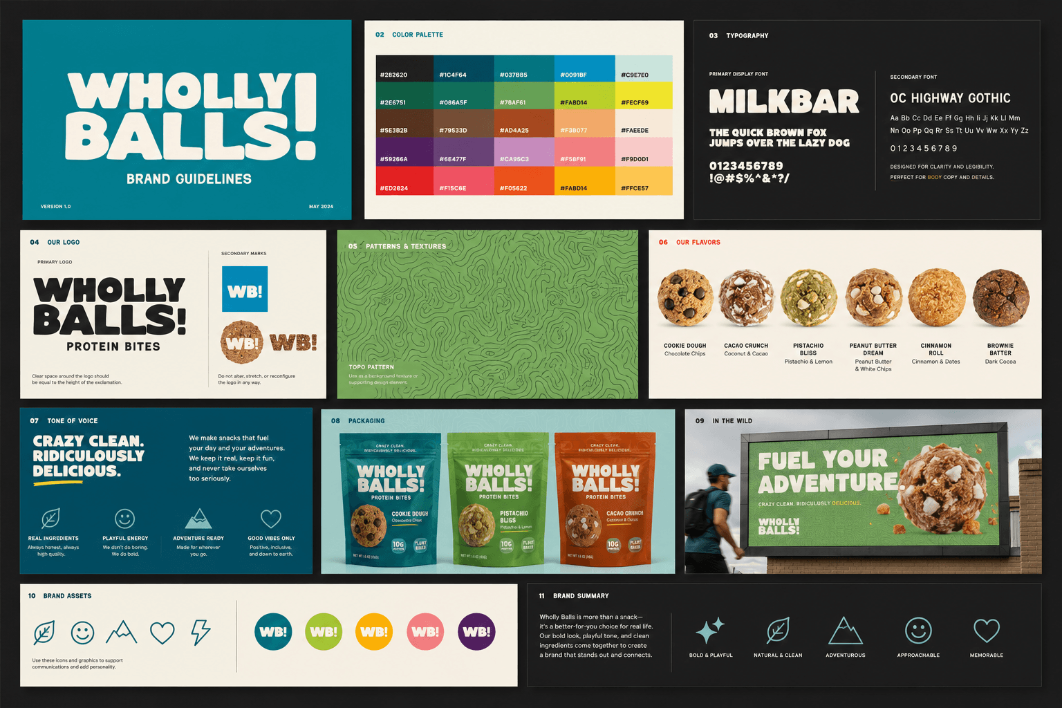
The rebrand leans into the confidence of the name without making the product feel like a novelty. Big, rounded letterforms give the identity a friendly punch, while the supporting system keeps it flexible enough for labels, merch, social, and brand guide documentation.
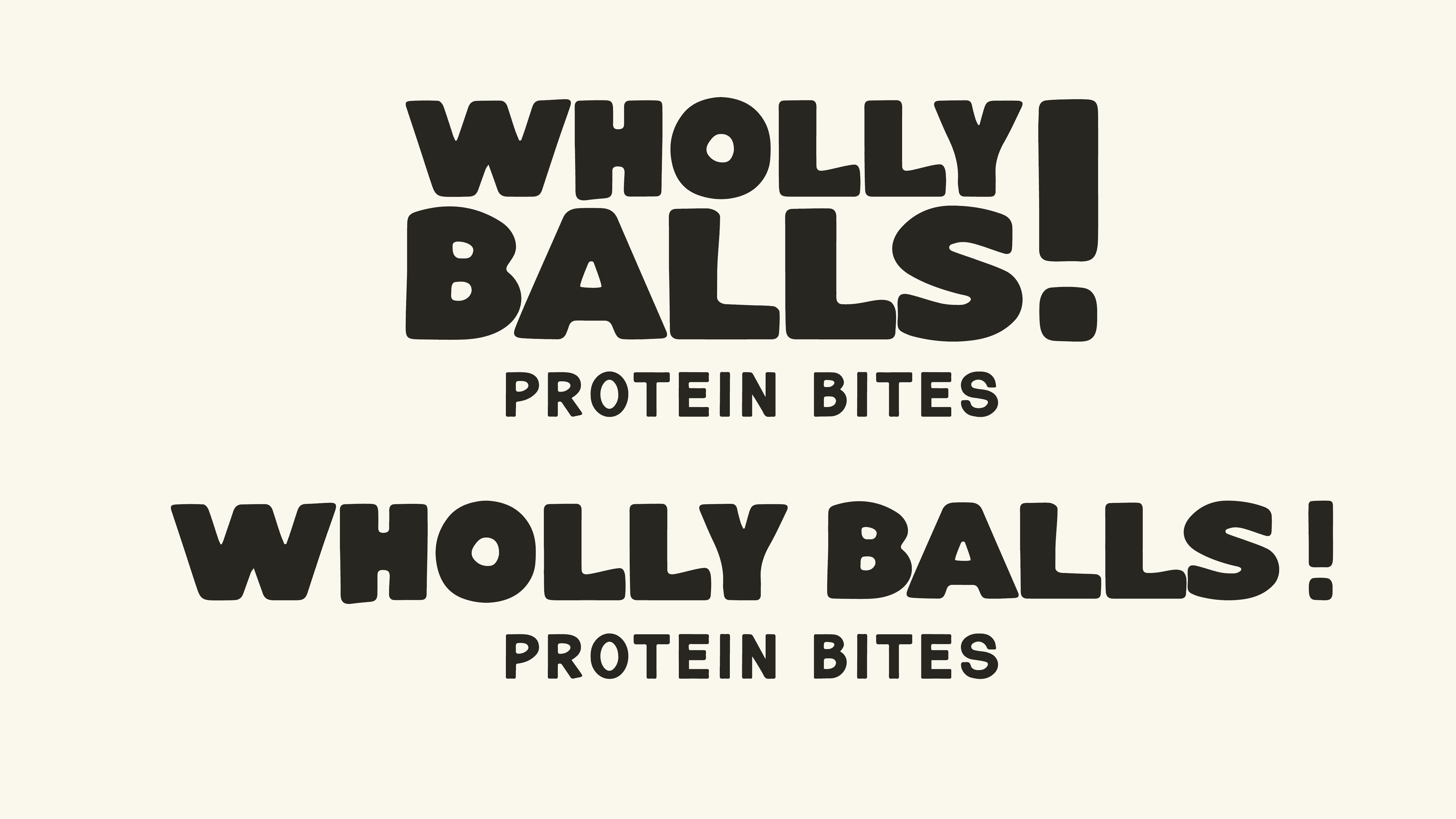
The identity needed to feel approachable, a little cheeky, and still polished enough to support a food product. The mark does the heavy lifting: simple, loud, and easy to recognize fast.
02
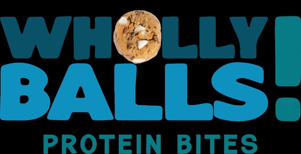
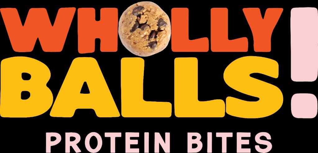
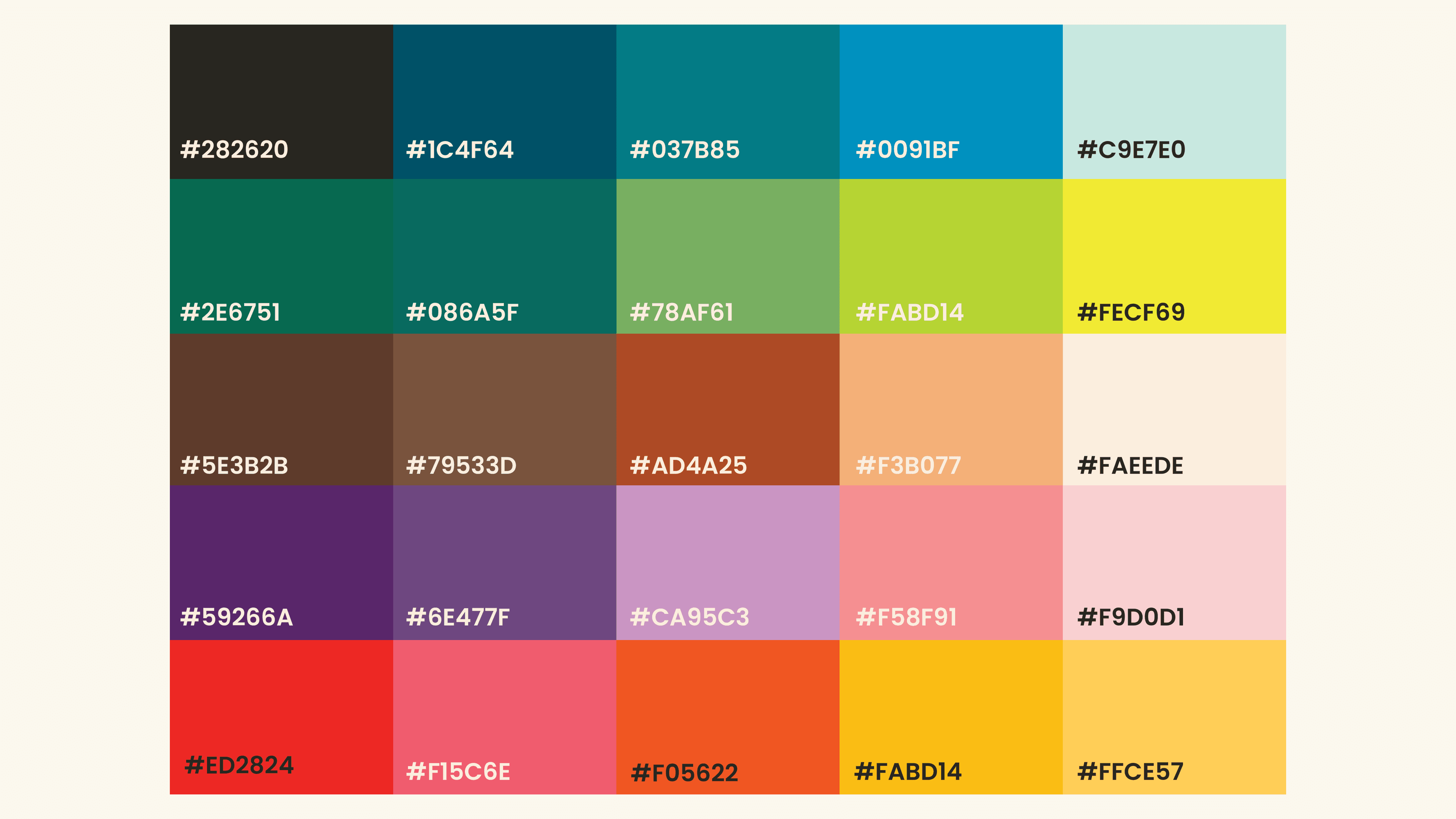
Building a colorful flavor system
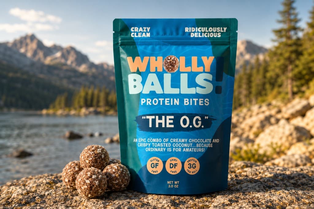
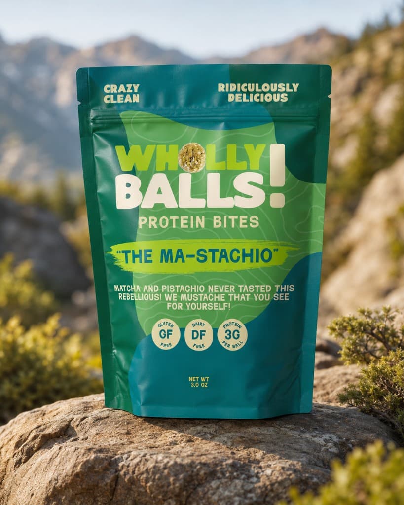
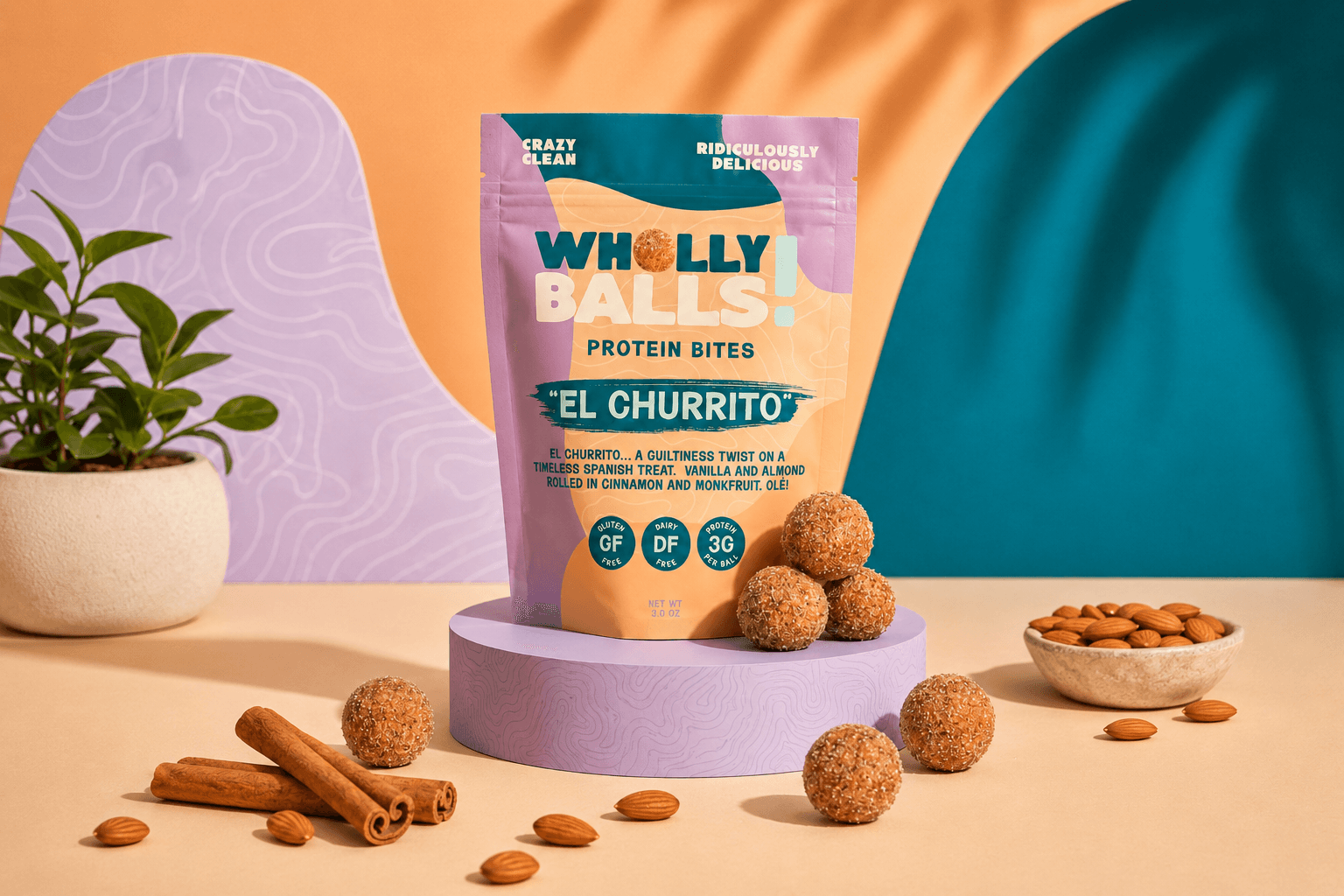
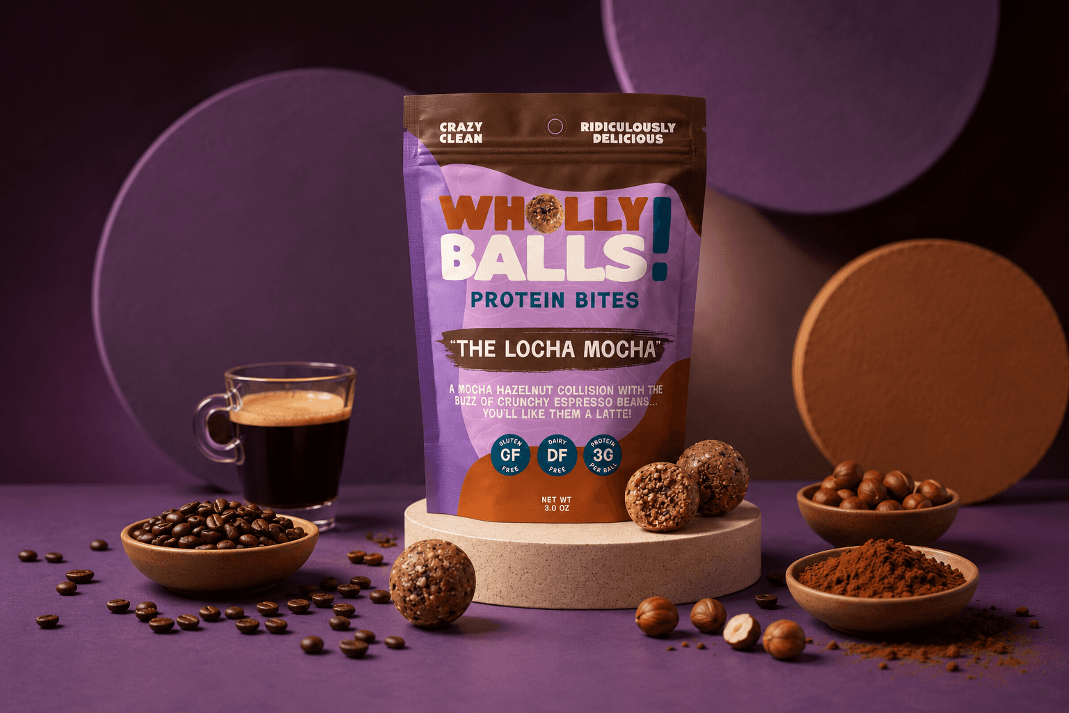
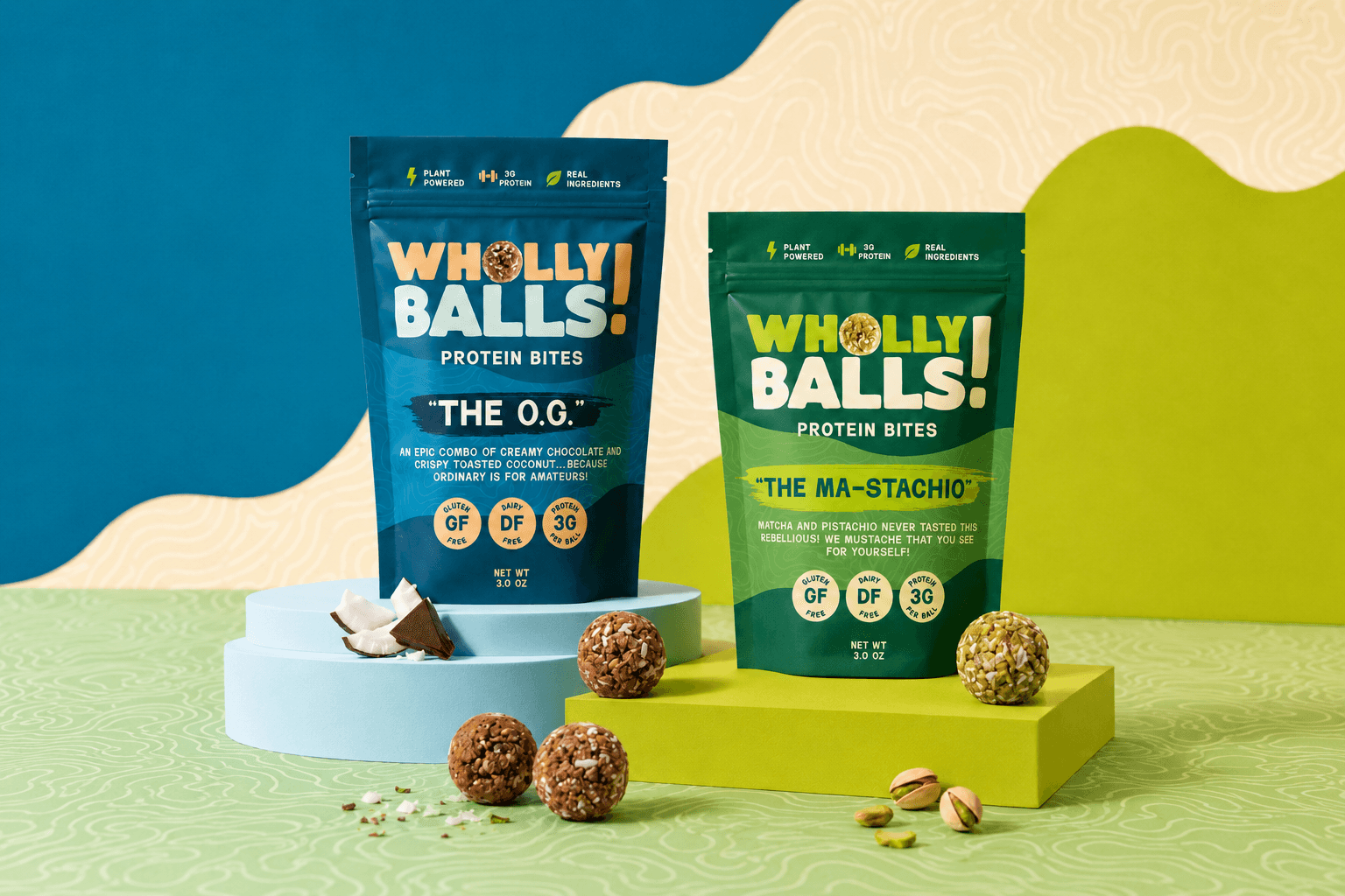
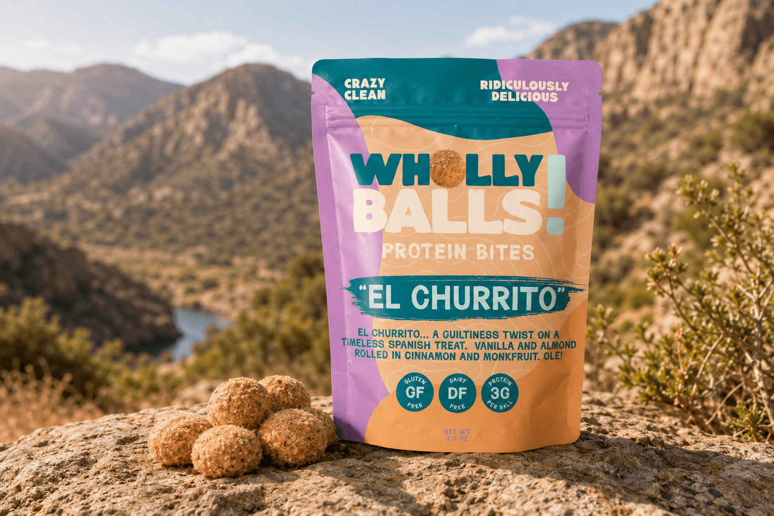
The palette gives the brand room to organize flavors while keeping the whole family connected. Teal, citrus, berry, earth, and cream tones let the packaging feel energetic without losing the natural-food cues.
03
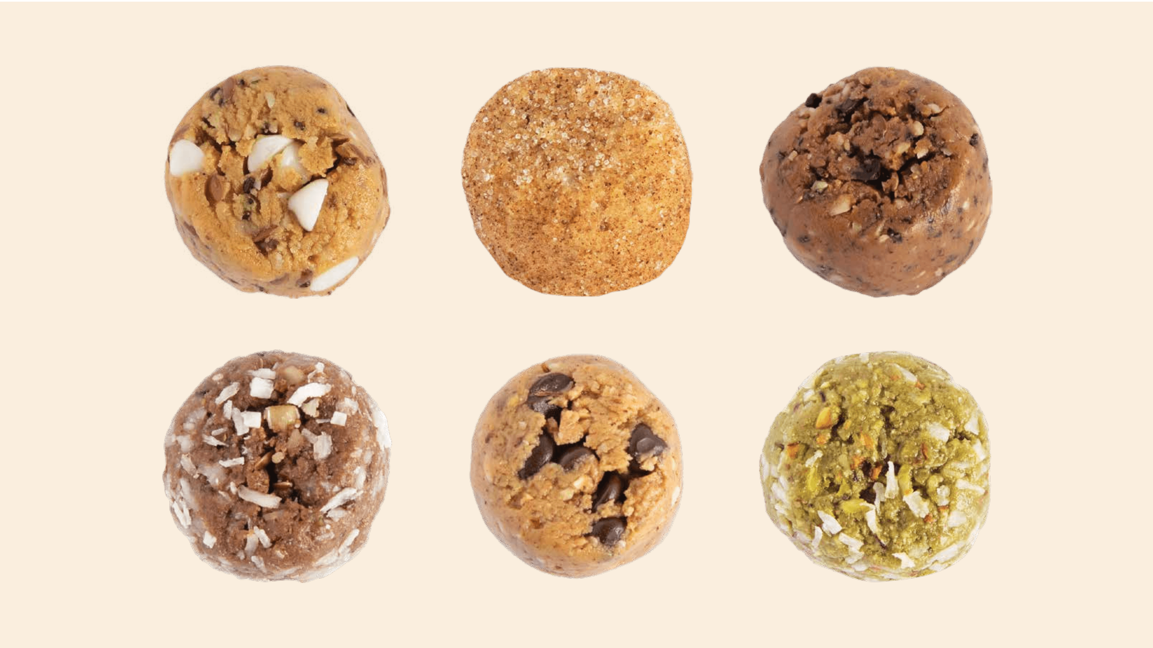
Letting the product texture lead
Instead of over-staging the mockups, the system uses real product texture as part of the identity. Protein bites, ingredient color, and the WB shorthand become graphic material that can work across simple packaging and campaign assets.
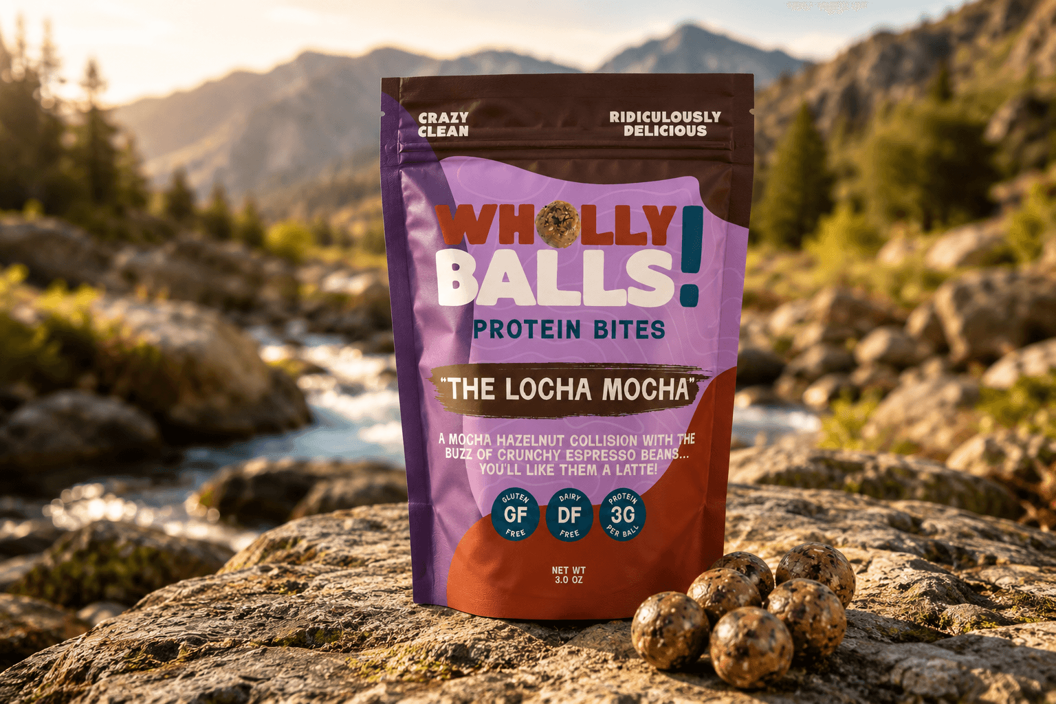
04
Packaging as a brand carrier
The packaging mockups are here to show the system in context, not to overpower the brand work. The label direction keeps the mark prominent and lets color, type, and product texture do most of the communication.

Have a project in mind?
Let's bring it to life.